

From photograph to visual fiction: directing images with AI
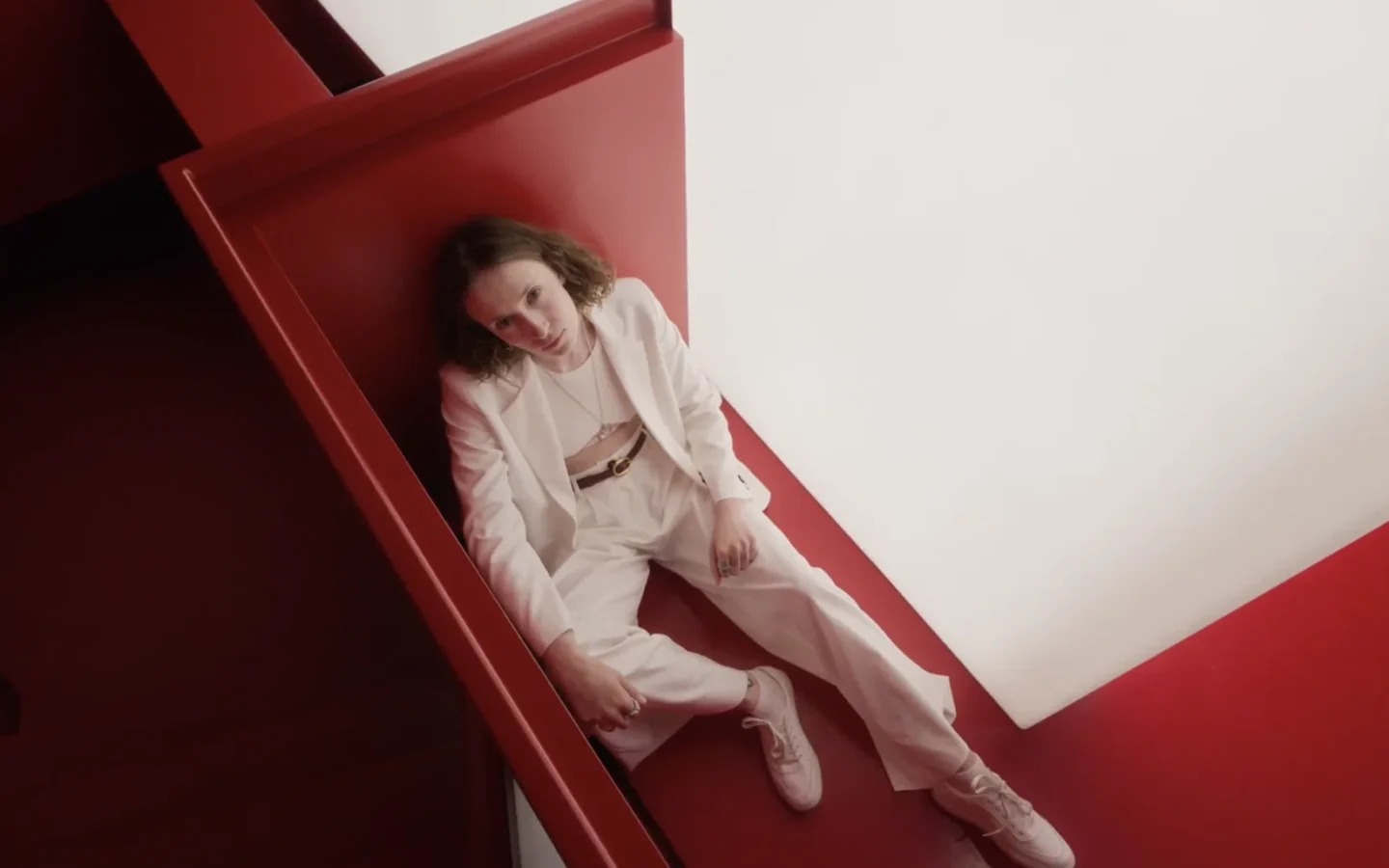

A photograph can document what stood in front of the lens, but artists often want to push beyond that first record. They may want to change the time period, exaggerate a colour, combine references, or build a sequence around one recurring figure. Nano Banana on Kimg AI belongs to a growing group of tools that treat an existing image as material for further direction. The interesting question is not whether AI makes an image “art.” It is how a creator uses selection, intention, and revision to give the result a point of view.
The source image is a beginning, not an answer
A useful source photograph does not need to be perfect. It needs to contain something worth protecting: a posture, expression, object, texture, or relationship between people and space. That element becomes the anchor while other parts are changed.
Consider a street portrait taken at dusk. The light may be flat, the background cluttered, and the clothing ordinary. Yet the subject’s stance might carry the whole image. An AI edit could place that figure in a sparse theatrical set or translate the scene into a graphic illustration. The successful version would preserve the tension in the pose rather than merely adding visual effects.
Before editing, name the element you refuse to lose. This simple decision gives the transformation a boundary and prevents the source from disappearing beneath style during every later revision. It also gives collaborators a clear reason for accepting or rejecting each change.
A prompt works best as direction
Prompts are often described as commands, but visual work benefits from thinking of them as direction. A director does not only say what objects should appear. They decide where attention goes, what emotion a gesture carries, and which details should remain quiet.
Instead of asking for “a surreal Mexican city scene,” describe the visual relationship: “Keep the solitary figure small in the frame. Replace the buildings with oversized concrete forms. Use late-afternoon orange light and deep blue shadows. The street should feel familiar but slightly impossible.”
This kind of instruction gives the model a hierarchy. The person remains the emotional centre, the architecture creates pressure, and the colour sets the mood. The prompt is still concise, but it contains a visual argument rather than a list of fashionable words. Read it aloud once; vague instructions become much easier to notice when they are spoken.
Three ways to build a stronger visual idea
AI image tools become more interesting when the creator begins with a method rather than an effect.
- Reinterpret one photograph through a clear lens
Choose one photograph and one conceptual lens, such as memory, urban isolation, performance, folklore, or consumer excess. Change only the elements that support that theme. For a portrait about memory, soften the room while keeping the face sharp. For urban pressure, compress the architecture around the subject. Do not add symbols simply because they look unusual. Each new detail should deepen the idea already present in the source rather than simply decorate it.
- Combine references with specific roles
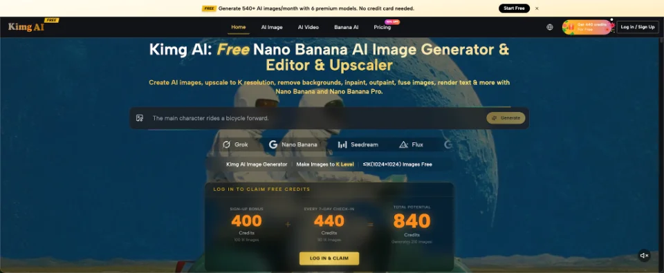
Multiple references can bring together elements never photographed in one place. Kimg AI says its Nano Banana AI workflow supports several reference images for compatible tasks. Assign each one a role: character, garment, environment, or colour treatment. Explain the relationship directly: “Use the pose from image one, mask from image two, wall texture from image three, and palette from image four.” The artist still decides what belongs together and why.
- Create a sequence instead of one spectacle
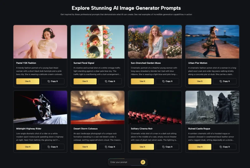
One dramatic image attracts attention, but a short sequence can develop an idea. Keep a recurring character, object, or location, then change one condition across several images. A market stall might appear at dawn, midday, evening, and after closing. A fashion sequence might keep the garment stable while the setting shifts. Consistency matters more than perfect repetition. Fixed features create continuity; the changing element carries the narrative across the complete sequence.
Style transfer should serve the subject
Turning a photograph into anime, collage, painting, or poster art is easy to describe and tempting to overuse. The stronger question is why that style belongs to the subject.
A rough photocopy look might suit an image about underground music because it recalls flyers, zines, and cheap reproduction. A clean commercial illustration may work for a design explainer but flatten a portrait that depends on ambiguity. Photorealism may intensify an impossible scene, while a deliberately flat style can make an ordinary object feel symbolic.
Test styles against the emotional weight of the source. Compare the altered image with the original and ask what became clearer, stranger, or weaker. If the transformation makes the image more fashionable but less specific, it has moved in the wrong direction. A recognisable style is not the same as a personal visual language, and technical polish cannot replace a reason for choosing it. Keep the strongest test beside the source so the comparison remains visible.
Revision is where authorship becomes visible
The first generated result is rarely the most meaningful one. Authorship appears through rejection, correction, and choice. You decide that the eyes are too theatrical, the street looks too polished, or the colour makes the scene sentimental. Then you revise.
Change one issue at a time. Ask the tool to preserve the composition while reducing background detail, or keep the face while changing the lighting. Broad rewrites often erase the parts that were already working. Save a strong version before testing another direction.
Keep several stages: source, first result, corrected version, and final selection. Looking across them reveals what your decisions added. You may discover that you repeatedly choose distance over close-up, muted colour over spectacle, or ambiguity over explanation. That record can become a practical map of your own visual preferences rather than a folder of disconnected experiments. Add a short note explaining why the final version survived the review.
Ethics belong inside the creative process
When an image includes a real person, transformation raises practical questions. Did they consent to the photograph? Would they reasonably expect their face or body to be altered? Could the final picture place them in a misleading, sexualised, political, or damaging context?
Answer these questions before publication, not after a reaction. The same care applies to culturally specific clothing, symbols, and rituals. Combining references without understanding their meaning can turn experimentation into careless appropriation. Research the material and avoid treating cultural identity as a visual costume.
Creators should also distinguish documentary images from invented or heavily altered ones. A caption, process note, or exhibition statement can provide necessary context without weakening the work. Transparency does not remove mystery; it prevents the audience from mistaking fiction for evidence and helps collaborators understand the limits of the image. It also protects the work from being circulated later without its original context.
Conclusion
AI image generation becomes more valuable when it extends a visual decision instead of replacing one. Protect the strongest element in the source, direct attention through the prompt, and use references with defined roles. Build sequences when one image cannot carry the full idea, and revise until the style supports the subject. Begin with a photograph that already matters to you, write down what must remain, and make the transformation answer to that choice through every later revision and final selection. Let the first experiment remain small enough to review honestly.
Redacción
Daniel Geyne
Fotógrafo, periodista y columnista en Yaconic. Experto en la escena musical alternativa y subgéneros como el Trip Hop, Metal y Punk Rock. Mi análisis, fundamentado en la Teoría Visual y Cinematográfica (Artes Visuales y Cine), me especializó en desglosar la estética underground. Con la perspectiva insider de mi trabajo en medios (Sabotage) y campañas publicitarias (Audi, Liverpool), te ofrezco una crítica única sobre cómo el arte, la contracultura y la imagen de marca interactúan.